1D-feature embedding
The 1D-feature embedding widget can be used to display the distribution of genomic regions with regards to a collection (see here for more details on collections) of 1D features. It represents a 2-dimensional embedding of the genomic regions as a heatmap of points.
Suitable data
The 1D-feature embedding widget is suitable for a collection of 1D features. 1D-features are any genomic dataset that can be represented using a bigwig file. This includes coverage tracks for Chip-seq experiments, Gro-seq experiments, but also features derived from Hi-C data such as insulation scores.
Preprocessing algorithm
Point-regions
During the preprocessing stage, the value of each 1D-feature at each region (+/- the respective binsize) is extracted and stacked into a feature matrix as follows:
| Feature 1 | … | Feature k | |
|---|---|---|---|
| Genomic region 1 | 0.1 | … | 1.5 |
| … | … | … | … |
| Genomic region n | 0.8 | … | 0.4 |
Where k refers to the number of features in the respective 1D-feature collection and n refers to the number of genomic regions in the respective region set. Following this step, umap is used with default parameters to get a 2-dimensional embedding of the genomic regions.
Additionally, the regions are clustered using k-means clustering into two different cluster-sets (one with a high number of clusters and one with a low number of clusters; see the configuration section on how to change these numbers). The average magnitude of all features within each cluster is saved and then used to display information thumbnails (see the visualization section for more details).
Interval-regions
Interval features are treated exactly as point features, except that instead of the value at the region, the average value over the region defined by the start and end is taken.
Visualization
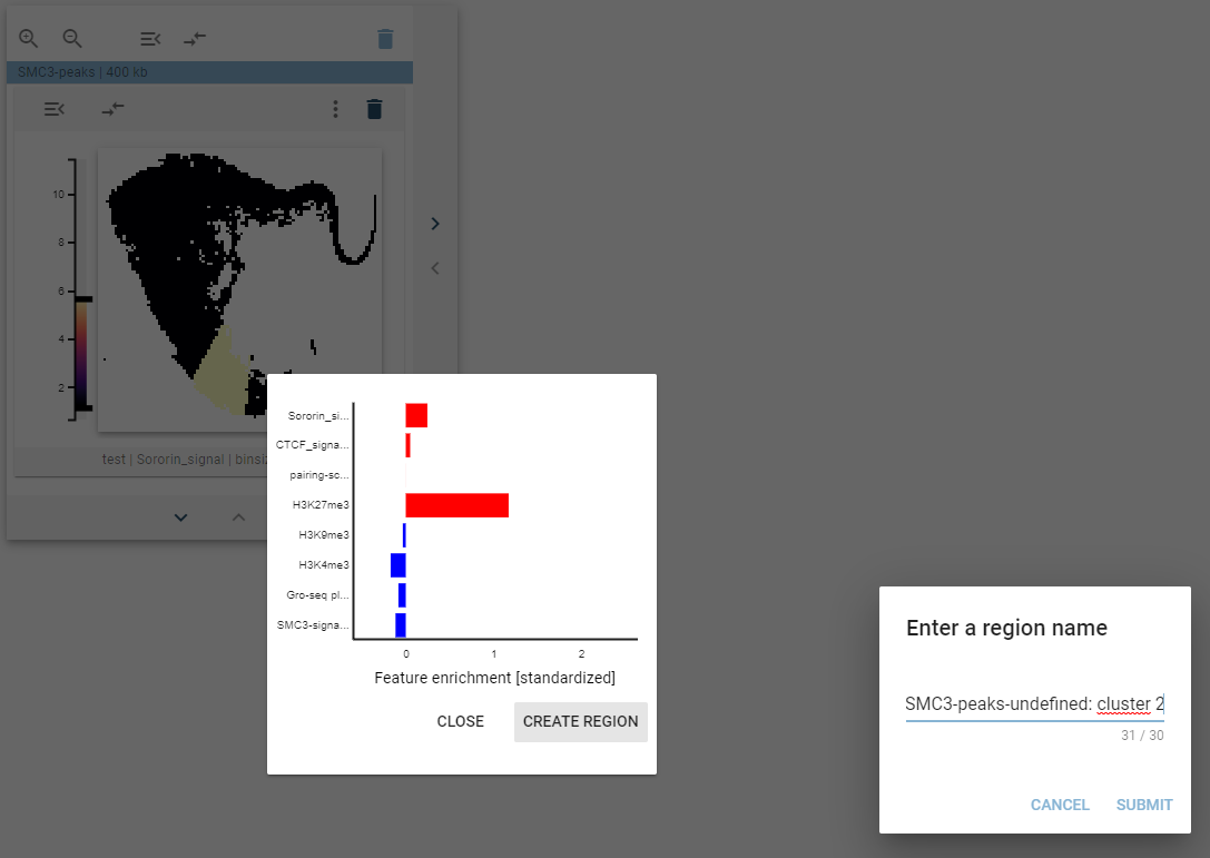
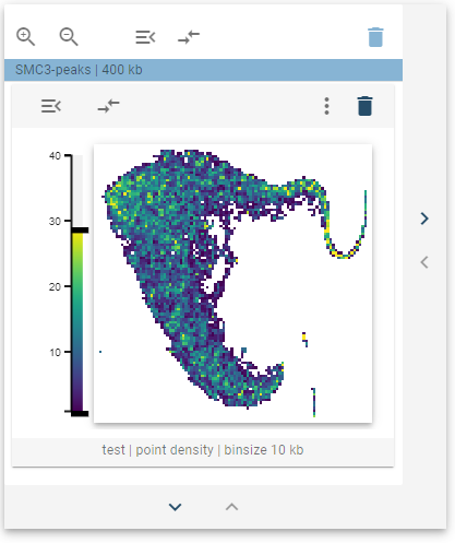
The distribution of the genomic regions with regards to a collection of 1D-features is visualized as a 2D-histogram, with the density of points being displayed using a colormap. This widget defines a tooltip that, when hovered over the points, will display the feature distribution for the highlighted cluster.
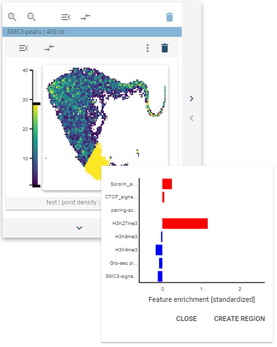
The highlighted clusters are defined as described above, and the bar plot of the features defines the standardized feature values (0 mean and unit variance), with positive values being marked red and negative values being marked blue.
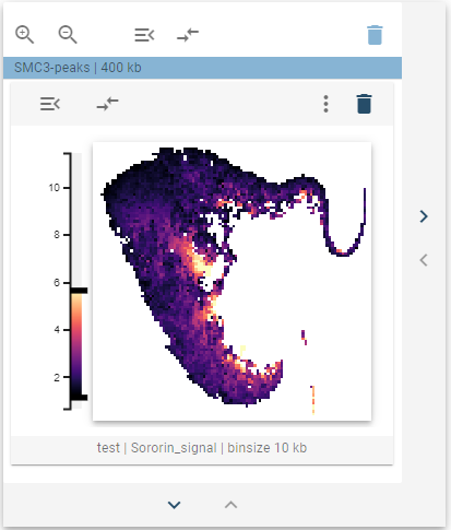
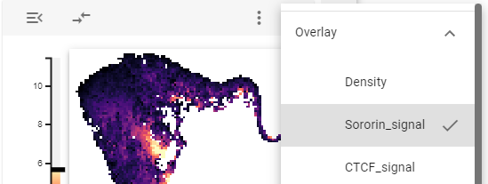
The underlying 1D features can also be visualized by overlaying the respective values using the overlay controls (see below). Here, the colormap is switched to represent the selected feature value.
Widget controls
The 1D-feature embedding widget defines two controls on the widget and one control on the bar chart tooltip.
Overlay
The overlay controls allow choosing a feature from the underlying 1D-feature collection to overlay over the heatmap. To avoid mixing density and overlay magnitude, the average value of the overlayed feature is displayed for each bin. In addition, the default density overlay can also be selected here.
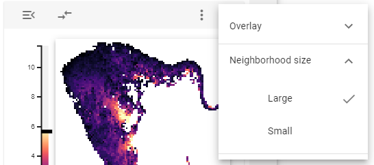
Neighborhood size
One can use the neighborhood size option to choose whether to display large or small clusters (for defining the respective sizes, see the configuration section) in the barplot tooltip.
Create new regions
If one of the highlighted clusters is interesting and you want to explore them further, you can create a new genomic region set representing the highlighted regions. For this, when the barplot tooltip is shown, click on the “Create new region” button will appear. After clicking that button, a dialog pops up that lets you define the name for your new region set.